A week ago, a new version of Stimulsoft products 2022.1 was released. In this version, we realized many new features and improvements. Some of them were presented here and here. Today it's high time to tell you about a new type of chart – 3D Pie chart.
Introduction
A 3D or three-dimensional pie chart is a separate type of chart. It is available in the report designer in the chart selection menu and has all features of a pie chart.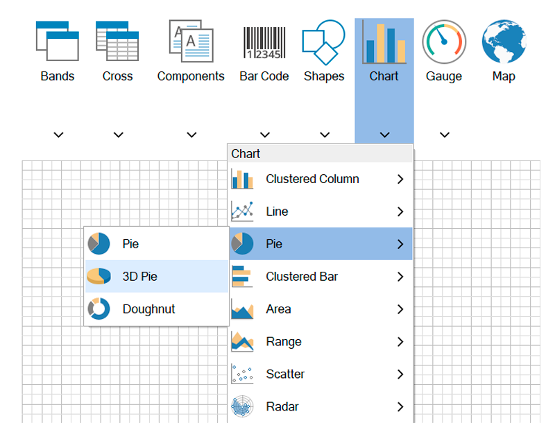
3D Pie chart in the report designer
So, let's figure out how this type of chart works in our product. Data for this chart is specified as well as for a basic 2D chart. In this article, we will consider how to set the appearance of the chart. However, first of all, let's check out how the element looks like: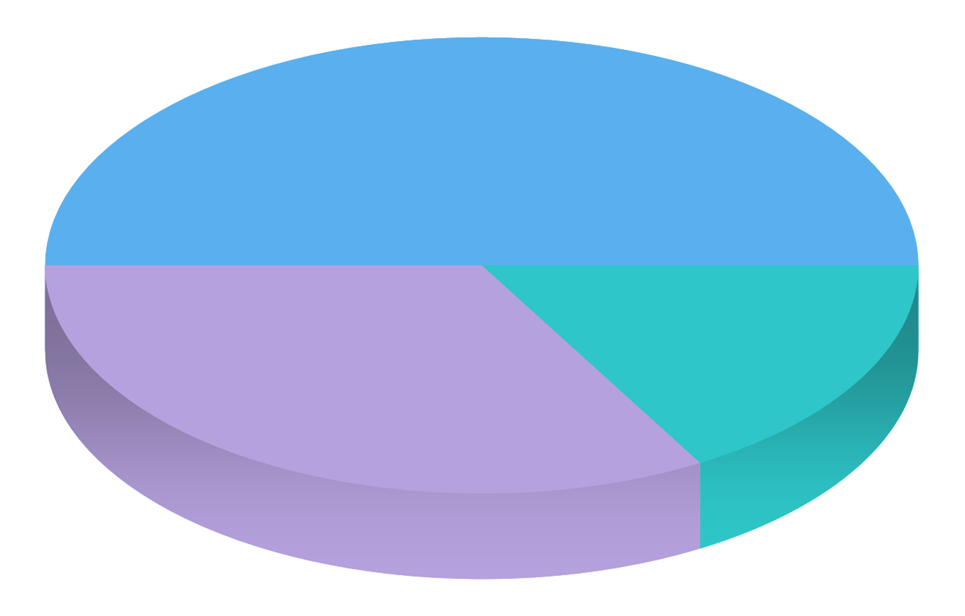
Chart appearance is set using the 3D Options property group
The following 3D options are presented on the properties panel - Distance, Height, Lighting and Opacity. Using them you can set a 3D Pie chart. Let's briefly go over all the options.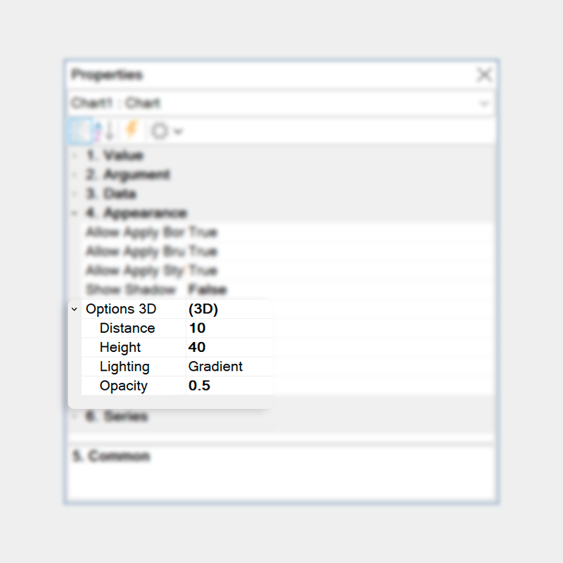
Distance
It regulates the distance between chart segments, that first of all changes chart appearance.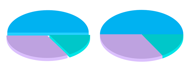
Height
The Height property allows you to change the thickness of chart segments, having added visual volume to them.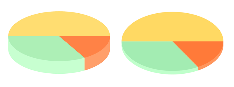
Lighting
Setting of chart fill. Three options of filling are available: no (no fill), solid (one color fill), and gradient (transition from one fill color to another).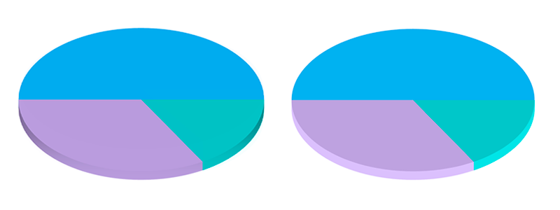
Opacity
This option changes the transparency of chart segments.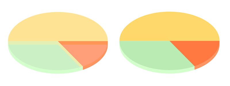
We prepared several samples of reports for you, where a 3D pie chart is used
3D Pie chart interaction
The functionality of the basic pie chart was transferred to the 3D version. Now it has the same properties of interaction:Filters
This functional feature allows you to filter element data by related fields. This way, chart elements interact in dashboards, and related data are displayed.Tooltips
In this case, tooltips are additional information displayed when hovering the cursor over some elements. The following tooltips are available for dashboards: hyperlink, value, text, and their combinations.TopN
The option is used to filter data of chart elements by displaying a certain number of maximum and minimum values.Open hyperlink
To open a hyperlink, you should click the left mouse button on a chart segment.Drill-down
Drill-down in dashboards is the process of going to the lower or upper level in the hierarchy of chart data elements. This feature is applied to call a drill-down template page or an external report.In addition, please watch a video on our YouTube channel, where the process of working with a 3D pie chart in reports and dashboards is described in detail.
We hope that this article was helpful for you, and now you are able to use a 3D pie chart in reports and dashboards. If you have any questions, contact us – we are glad to help you!