We are pleased to announce the release of a new version of Stimulsoft Reports and Dashboards 2022.4! In the latest version, we have added 3D charts, GS1 barcodes, the new component - Electronic signature, additional authorization options in our services and applications, optimized the UI of the report designer, and, in general, made your work with data more convenient and efficient.



New 3D charts
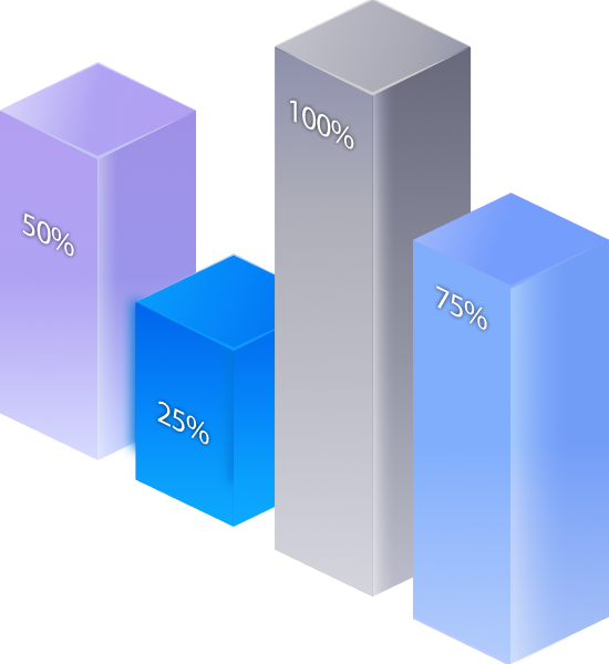
We have added 3D bar charts for reports and dashboards. Now you can display data as 3D Clustered Column, 3D Stacked Column, and 3D Full-stacked Column. When using 3D charts in reports and dashboards, you can also change the geometry of the series of graphical objects by defining them as Box, Pyramid, and Partial Pyramid. When creating a standard 3D multi-series bar chart, you can also specify the display mode of the graphic objects for the argument - side-by-side or behind. This behavior is determined by the value of the Side-by-Side chart area property. Histograms are presented as separate types in the chart selection menu.
Optimizing JS components
The support of various screen scales has been implemented for the following products: Reports.JS and Reports.PHP, Dashboards.JS and Dashboards.PHP. In addition, the changes affected the transfer of all themes and styles of components from CSS to JS scripts. Now, you don't need to include CSS files when using JS components in a project. All the images that are used in JS products have been converted to the WebP format. Also, we have added a new method -setTheme(themeName) to set a theme of the designer and viewer. Additionally, the theme property has been added to set a theme of a JS component by default.New GS1 Barcodes
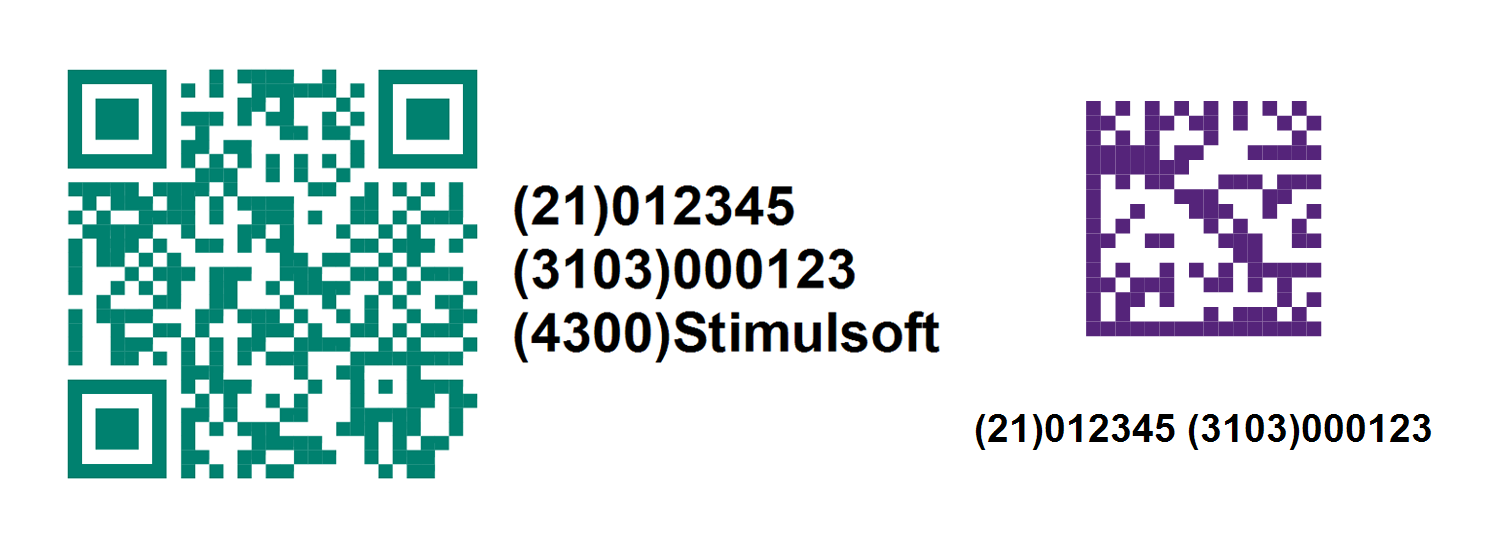
In the new version of our products, we have added several new barcodes – GS1 DataMatrix and GS1 QR Code. The GS1 standard describes the proper usage of data and barcodes in business applications. As a carrier, standard barcodes are used. Using special barcode commands, information is recorded in them in a certain way. New barcodes allow you to record data in a simple and understandable way, and all the necessary commands are added automatically.

MariaDB data source
In this release, we have added a new adapter for getting data from MariaDB Server storage. It is one of the most popular open-source relational databases. Select MariaDB to create a data source on the SQL tab in the New Data Source window. After creating a connection and running a query, you can create reports and dashboards based on retrieved data.
Electronic signature
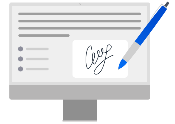
In release 2022.4.1, we added a new component - Electronic signature. Using this component, you can sign reports graphically - enter, draw, or insert an image of a handwritten signature. You can also add some text, for example, name, initials, company, job title, etc. Moreover, combinations of different ways of signing the report are possible. You can sign a report in design mode or when viewing it.PDF digital signature
We have added a new component - PDF digital signature. You may use it to add a digital signature to a report using Adobe PDF after converting it into a PDF document.
Reference
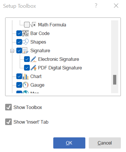
To display Electronic Signature and Digital PDF Signature elements on the toolbox, you should flag them in the toolbox settings.
To display Electronic Signature and Digital PDF Signature elements on the toolbox, you should flag them in the toolbox settings.
New authorization options
In this release, we have added the ability to log in to the Stimulsoft platform using web services such as GitHub and Facebook. Now you can use credentials of these services when logging into the report designer, company or personal account, or Stimulsoft Cloud.
Formatting dates in the Text element
In version 2022.4.1, we added the ability to apply date formatting to the Text element in dashboards. In general, the element does not support the ability to use the Text Format tool, but it supports the Format function in an element expression that can be used to define a format mask for displaying dates. For example, use the expression{Format("{0:yyyy}", Today)} or {Format("yyyy", Today)} to display only the year from the current date.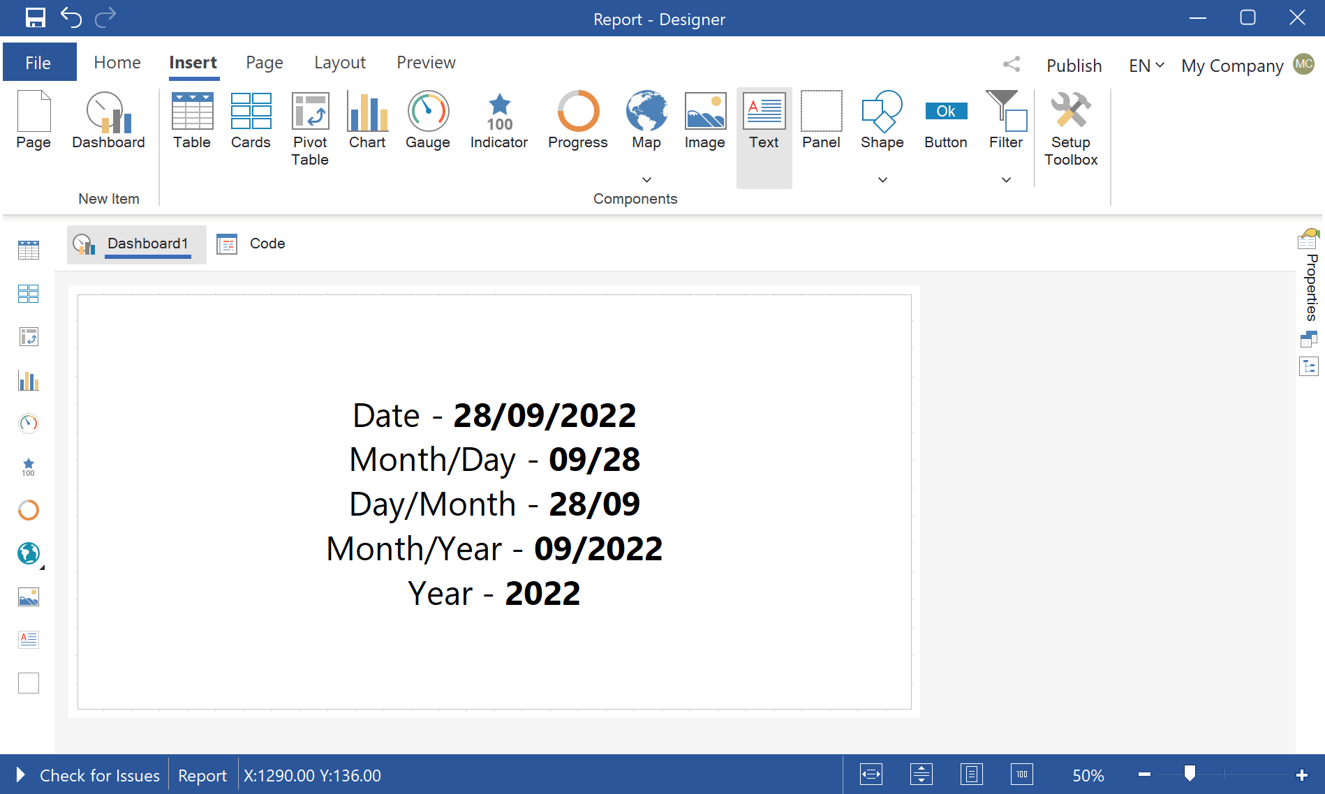

Title alignment in the Table element
In release 2022.4.1, we added the ability to horizontally align the column title text in the Table element of dashboards. Alignment is configured for each table column using the Horizontal Alignment property. It has the following values that correspond to the position of a title - left, right, and center.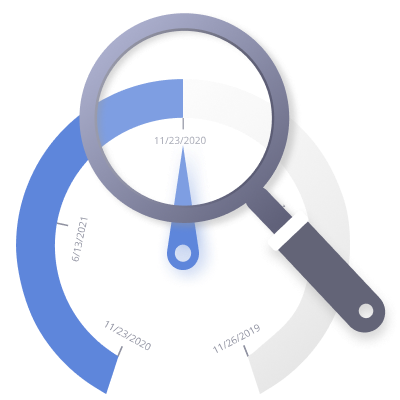
Time intervals in the Gauge element
We are expanding the capabilities of the Gauge element in dashboards. Now you can use all types of gauges to visualize time intervals. Specify data columns with the DateTime type and set the Date and time parameters in the element editor. The time interval range for the gauge scale can be specified automatically or manually. The element can also display the target value as a date.Interface improvements
We are constantly working on enhancements in our tools. And this does not always apply to issues with functionality - the speed of obtaining data, their processing, etc. In this release, improvements were felt in the appearance of the report designer and the usability of the tool. Changes were applied to the location of some menus, optimization of the components and elements editors, as well as the style settings of the application. For web components, a new Office 2022 design theme has been added. It is used by default. For this theme, you can use several color accents and several background colors such as white, gray, and black.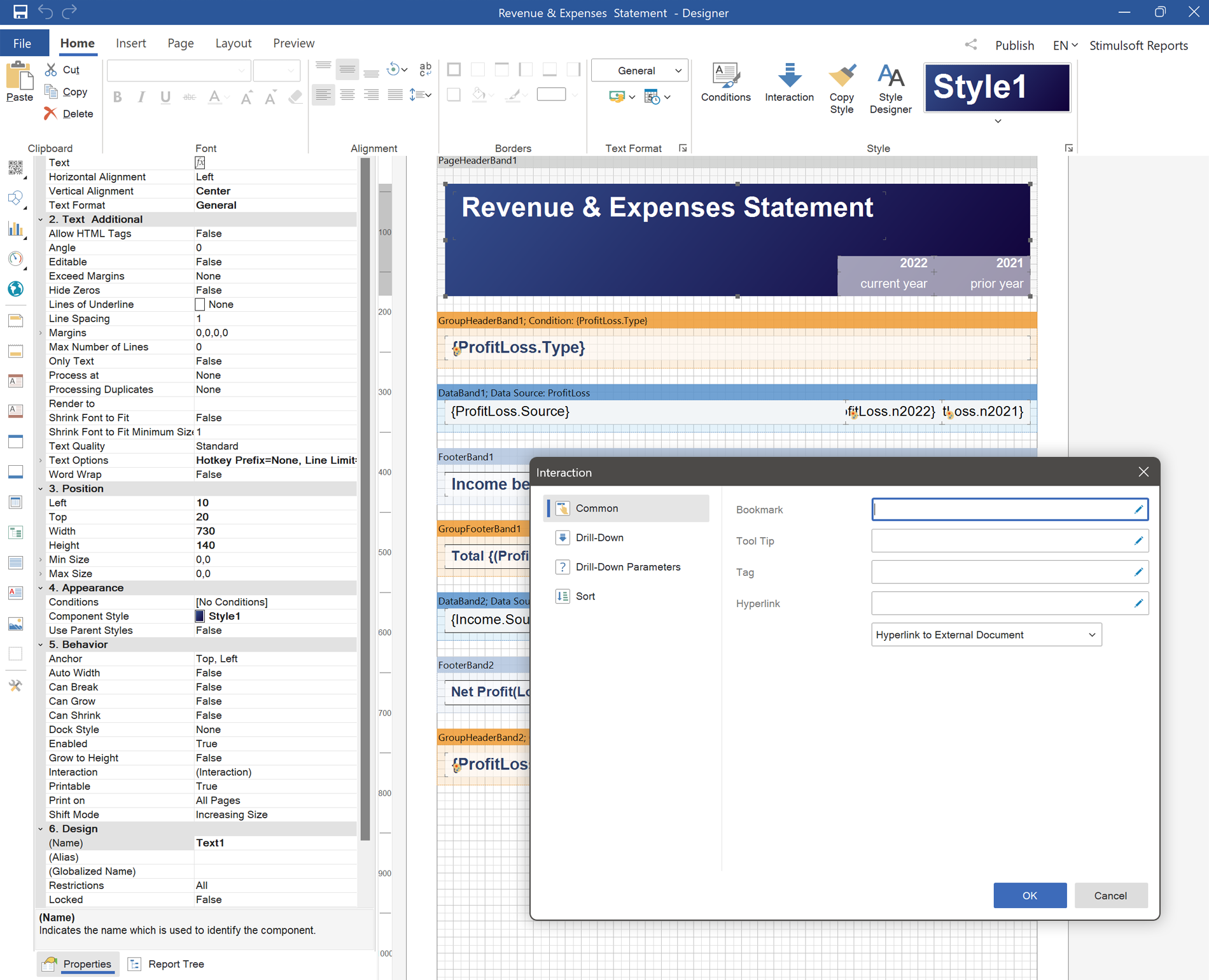
You can download a new version from this link.