In the 2024.3 release, we have added the Heatmap chart, making data analysis even more visual, faster, and more convenient. With color gradation, you can instantly identify key trends. That’s why heatmaps, one of the most user-friendly visualization tools, are increasingly used across various fields, from marketing to medicine.
A heatmap is a graphical representation of data where values are displayed using a color scale, allowing users to quickly detect patterns and uncover hidden relationships.
In Stimulsoft products, the Heatmap chart can be created in both reports and dashboards, making it a universal tool for data visualization in various scenarios.
1. Web analytics and marketing
Want to know where users click most often on a website? Heatmaps highlight active interface zones, helping optimize design and improve user experience.
2. Financial analysis
On stock exchanges, heatmaps help track stock price movements: growth is displayed in green tones, while declines appear in red. This makes market analysis more visual and efficient.
3. Geographical research
Population density, crime rates, temperature anomalies - all of these can be conveniently represented using color maps.
4. Medicine and biology
Doctors and scientists use heatmaps for disease diagnostics, gene activity analysis, and even brain function tracking.
5. Education and science
Student performance analysis, online course attendance tracking, and identifying patterns in scientific research - all of this is possible with heatmaps.
1. Coordinate Axes. The X and Y axes often represent categories or parameters:
2. Color Cells. Each cell or zone on the map corresponds to a specific value.
3. Legend. Explains how colors correspond to specific values.
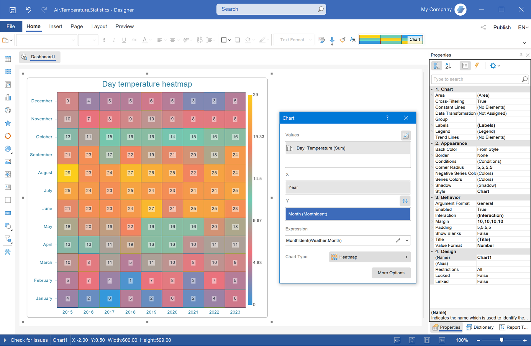
Step 1: Create a report or dashboard in Stimulsoft BI Designer
Create a new report or dashboard, or open an existing one.
Step 2: Connect a data source
Connect a data source for the heatmap.
Ensure that the data is correct and contains the necessary parameters for analysis.
Step 3: Add a heatmap chart
Now it’s time to create the heatmap:
That's it! Your heatmap now visually represents data distribution, helping you quickly identify key trends, anomalies, and relationships. Use filters, adjust colors, and fine-tune display settings to maximize information clarity.
1. Flexible color palette customization
Color gradation is a key feature of heatmaps. Using properties, you can:
2. Axis settings and data formatting
Properties allow you to control the layout and appearance of the chart:
3. Design and styling
In the properties, you can adjust:
In Stimulsoft products, the Heatmap chart can be created in both reports and dashboards, making it a universal tool for data visualization in various scenarios.
How does a heatmap work?
The principle is simple: the higher the value, the brighter or "warmer" the color. For example, cool shades (blue, green) indicate low values, while warm shades (yellow, red) represent high values. This approach helps instantly identify areas with the highest data concentration.Advantages of heatmaps
The following advantages of heatmaps can be highlighted:- Intuitiveness – data is easy to perceive visually;
- Anomaly detection – quickly identifies outliers and deviations;
- Dependency analysis – helps find correlations between variables;
- Flexibility – applicable across various industries.
Using heatmaps
Heatmaps are commonly used in the following areas:1. Web analytics and marketing
Want to know where users click most often on a website? Heatmaps highlight active interface zones, helping optimize design and improve user experience.
2. Financial analysis
On stock exchanges, heatmaps help track stock price movements: growth is displayed in green tones, while declines appear in red. This makes market analysis more visual and efficient.
3. Geographical research
Population density, crime rates, temperature anomalies - all of these can be conveniently represented using color maps.
4. Medicine and biology
Doctors and scientists use heatmaps for disease diagnostics, gene activity analysis, and even brain function tracking.
5. Education and science
Student performance analysis, online course attendance tracking, and identifying patterns in scientific research - all of this is possible with heatmaps.
Key elements of a heatmap
A heatmap consists of the following visual elements:1. Coordinate Axes. The X and Y axes often represent categories or parameters:
- X-axis defines the categories that distribute the data (e.g., time intervals or regions);
- Y-axis represents the second variable (e.g., product, branch, employee, etc.).
2. Color Cells. Each cell or zone on the map corresponds to a specific value.
3. Legend. Explains how colors correspond to specific values.
Creating a heatmap
You can create a Heatmap chart in Stimulsoft in just a few simple steps:Step 1: Create a report or dashboard in Stimulsoft BI Designer
Create a new report or dashboard, or open an existing one.
Step 2: Connect a data source
Connect a data source for the heatmap.
Ensure that the data is correct and contains the necessary parameters for analysis.
Step 3: Add a heatmap chart
Now it’s time to create the heatmap:
- open the toolbar and select Chart;
- in the list of available chart types, find the Treemap category and select Heatmap;
- link the required data to the chart, set the axis parameters, and choose a color scheme that best visualizes the results;
- click OK.
That's it! Your heatmap now visually represents data distribution, helping you quickly identify key trends, anomalies, and relationships. Use filters, adjust colors, and fine-tune display settings to maximize information clarity.
Main heatmap settings
The heatmap chart can be customized using the editor and property settings. 1. Flexible color palette customization
Color gradation is a key feature of heatmaps. Using properties, you can:
- choose a predefined palette (from cool to warm colors);
- configure custom color gradients;
- define minimum and maximum values for the color range.
2. Axis settings and data formatting
Properties allow you to control the layout and appearance of the chart:
- set labels for the X and Y axes;
- specify measurement units and number formats;
- optimize data display (grouping, rounding values).
3. Design and styling
In the properties, you can adjust:
- Cell size and shape. Customize the appearance of heatmap cells;
- Transparency. Adjust transparency to enhance readability and integrate the heatmap with other dashboard elements;
- Borders and spacing between cells. Enabling cell borders helps clearly visualize areas with different values.