We are continuing the series of articles dedicated to the innovations in version 2023.2 of our products. It's time to discuss the possibilities of creating dashboards using our analytics and data visualization tools. This article will primarily focus on a new feature related to the Pivot Table element, specifically the ability to display data in a data bars format within a table. Additionally, we will explore the sorting capabilities within charts.
In the new version, a Sort by field has been added, allowing you to specify any data column by which the data will be sorted. This means that the sorting capability has been greatly enhanced. You can now choose and modify any column for sorting, overriding the default sorting in the menu while editing or viewing the dashboard.
To showcase this new feature, we have created a professional dashboard for demonstration purposes.
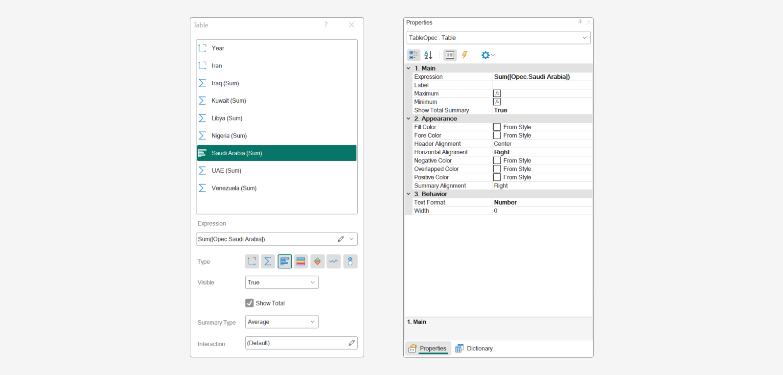
New Data Bars features
Within the Table element in the dashboard, there are several data representation options that can be applied to columns. One of these options is the Data Bars, which functions as a graphical tool for data analysis. In the Stimulsoft Reports and Dashboards 2023.2 release, the design settings for the Data Bars type have been significantly expanded:- The Maximum value and Minimum value properties are now used to define the range for rendering the graph. These values can be determined using the properties of the data bar field with the same name;
- The Positive color and Negative color properties are used to specify the colors of the data bars for positive and negative values, respectively. You can manually select a color or assign it from a component style;
- The Fill color property allows you to change the color of the data bar area;
- The Overlay color property determines the color of the data bar after exceeding the maximum and minimum values;
- The Width property, as the name suggests, is responsible for adjusting the width of the data bar. You should know that the default width is set to 0, which means that the column width is calculated automatically.
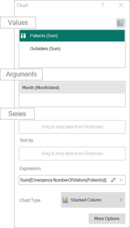
Sorting in the Dashboard Chart
Previously, data sorting in the dashboard chart was conducted based on three columns:- Values;
- Arguments;
- Series.
In the new version, a Sort by field has been added, allowing you to specify any data column by which the data will be sorted. This means that the sorting capability has been greatly enhanced. You can now choose and modify any column for sorting, overriding the default sorting in the menu while editing or viewing the dashboard.
To showcase this new feature, we have created a professional dashboard for demonstration purposes.
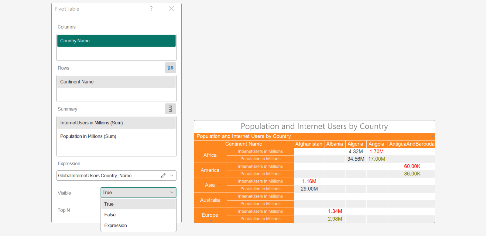
The new feature of the Pivot Table
The Pivot Table dashboard element now includes the option to enable or disable the visibility of data columns.If you have any questions or need further assistance, please don't hesitate to contact us.