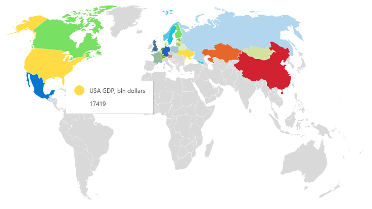
This is the new data visualization tool in the release 2015.3. Everybody knows that information is perceived better and easier if it is visualized. Using the map component, it is possible to visualize geographical data. For example, any geographical area can be painted in a specific color and are grouped according to a certain condition. Also the Map component supports tooltips that display the name of the geographical area and can also show the value.

Using maps in reports as a separate element as well as connected with other elements provides the ability to create reports easier in perception.

Using maps in reports as a separate element as well as connected with other elements provides the ability to create reports easier in perception.