We are thrilled to unveil the latest version of Stimulsoft Reports and Dashboards - 2023.2! Our team has been hard at work to bring you a host of new features and improvements, both in terms of functionality and aesthetics. We invite you to explore the numerous enhancements in this release and experience the full potential of our products.


A list of the new features in version 2023.2
- Dark theme
- New icons in UI
- Compiling for .NET 6 and .NET Framework 4.7.2
- The Watermark Style
- Java 11+ and Jakarta
- Styles for elements
- Angular 13
- Automatic switching between dashboards
- Indicators in charts
- Update of nullable types in variables
- New custom format
- Setting up the grid in dashboards
- PostgreSQL in Stimulsoft BI Server
- Options tab in Stimulsoft BI Server
- New features in the Publish Wizard - Support for ASP.NET Razor, .NET 7, Angular 14 and 15
- Chart and cross-tab globalization
- User Options
- Links in Stimulsoft BI Server
- New functions
- New dashboard events
- Font via expression
- New features in dashboard filtering elements
- New features of the Data Bars in dashboards
- Sorting in the dashboard chart
- Additional chart options
- New features for Pivot Table
- Relations in an OData data source
- Connection string editor for PostgreSQL, MySQL, and MariaDB
- New features for the Gauge
- Enhanced work with Conditions
- Copying Data Dictionary elements
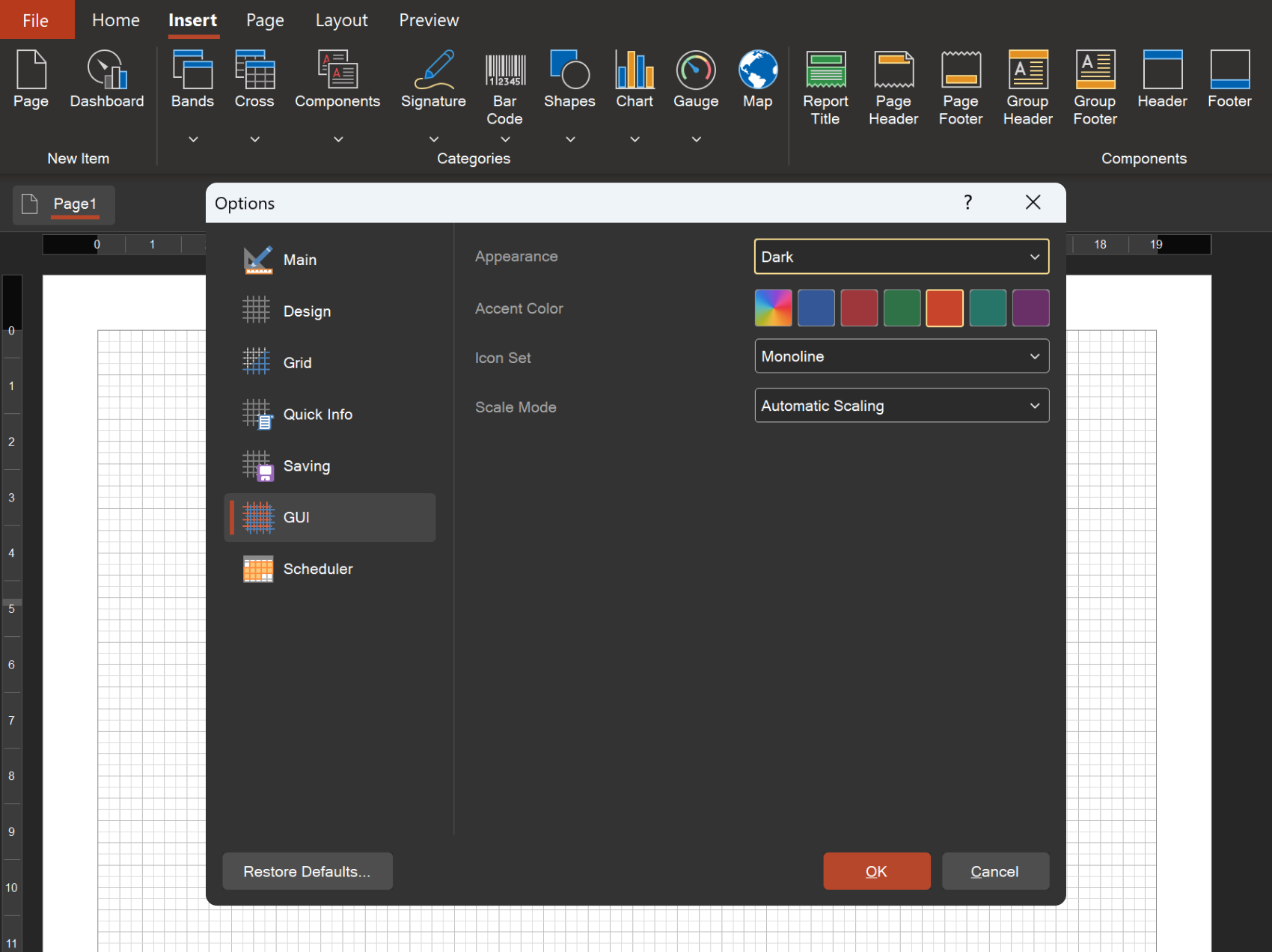
Dark theme
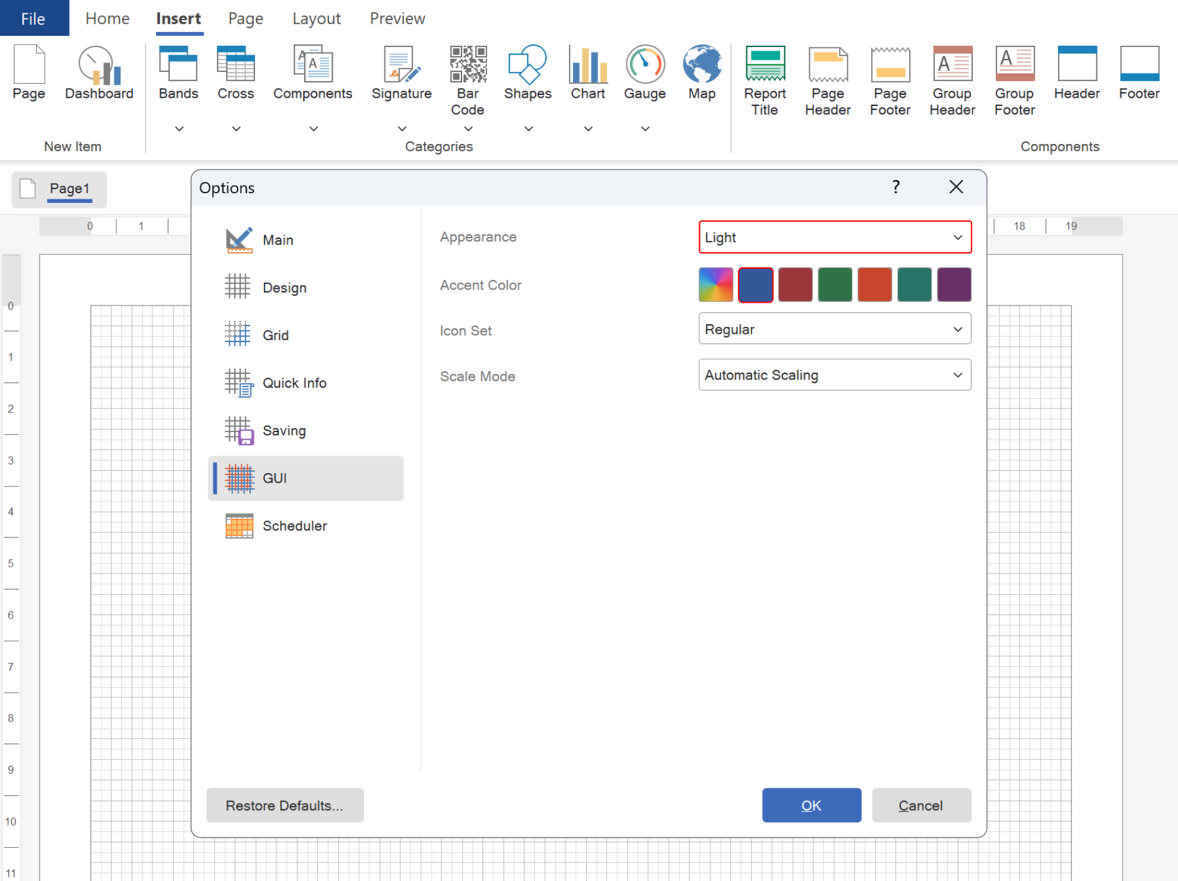
In release 2023.2, important changes have been made to the design of the Stimulsoft BI Designer desktop application and runtime components - the designer and viewer for WinForms applications. We added dark theme support for the report designer and viewer. You can easily switch between themes using the Appearance option on the GUI tab of the Options menu in the designer. The default setting is Auto mode, which automatically adjusts to the theme of the operating system. You can also customize the Accent Color of the designer and viewer, choosing from preset colors or an accent color from your operating system.New icons in UI
The Stimulsoft BI Designer desktop application and runtime components, including the designer and viewer for WinForms applications, can now choose between two distinct icon sets - Monoline or Regular. To make this customization, simply access the Options menu on the GUI tab in the report designer and select the Icon Set option. For the report viewer, choose the same-named option within the Preview Settings menu.Compiling for .NET 6 and .NET Framework 4.7.2
We have added the separate compilation of libraries using .NET Framework 4.7.2 and .NET 6.0. This new feature allows users to take advantage of the latest library updates, which can improve the speed, stability, and quality of the product. It's important to note that full compatibility with .NET Framework 4.5.2, .NET Standard 2.1, and .NET Core 3.1 is fully preserved, ensuring seamless integration with existing applications.The Watermark Style
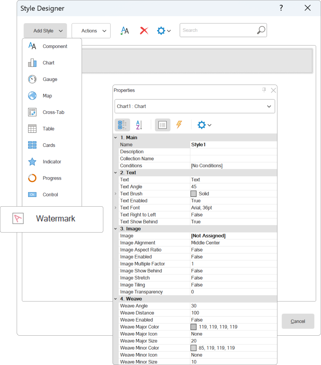
In this release, we have added the ability to create a Watermark Style. This feature enables users to create customized watermark designs and apply them to report pages, dashboards, and the dashboard Panel element. Once a watermark style is created and the settings are defined, it can be reused in other reports and dashboards. To apply the style, simply use the Watermark Style property of the page, dashboard, or dashboard Panel element.Java 11+ and Jakarta
Our Reports.JAVA report writer now supports the Java 11+ platform and Jakarta namespace. This exciting update provides users with expanded capabilities for using the report generator in Java applications.Styles for elements
For dashboard elements Text, Image and Panel, a new property Style has been added, with which you can apply a style of the Component type to customize the design. It's important to note that style settings will only affect the styling options that those elements have.Angular 13
Our Reports.ANGULAR product has been upgraded to utilize the latest version of Angular - Angular 13. This update unlocks the full potential of the framework for developing cutting-edge reporting systems in your applications.Automatic switching between dashboards
When viewing a template that contains at least one dashboard, each report page or dashboard is displayed on a separate tab in the viewer. In the new version, we have added the ability to automatically switch between these tabs after a specified period of time. You can define the time interval for switching using the Scroll Time report template property. The value you set will determine how many seconds the viewer will wait before switching to the next tab. By default, the property value is set to 0, which disables the automatic switching mode.Indicators in charts
An enhancement has been made to the Doughnut chart, allowing the display of an indicator and its title inside the ring. The chart indicator can either be a value or an expression. For reports, the Indicator property group can be configured in the chart area settings to display the indicator. In dashboards, the chart editor contains an Indicator field to specify the indicator value, while the color of the indicator and its title can be set using the Area.Indicator property group of the chart.Update of nullable types in variables
In this release, we have implemented a new approach for using nullable variable types in reports and dashboards. The null control is now integrated into the variable value field. If the checkbox is checked, the variable returns the specified value. If the checkbox is unchecked, then the variable returns null. Additionally, null support has been added for variables with boolean and string data types.New custom format
A new custom format [green]+0.00;[red]-0.00;blue has been added. This format allows you to highlight value ranges without having to apply conditional formatting. By selecting the component and setting the formatting to [green]+0.00;[red]-0.00;blue, you can specify the color names and value ranges for which the color will be applied.Setting up the grid in dashboards
When designing dashboards, alignment and docking of elements are often done using a grid. In this release, we have added the ability to change the grid spacing when creating or editing a dashboard. You can now set the grid spacing by selecting the Points option in the Options menu of the report designer, under the Grid tab.PostgreSQL in Stimulsoft BI Server
In the 2023.2 release, we introduced support for PostgreSQL as a storage option for server data. Previously, the server could only store its data in SQL CE, MySQL, and MS SQL databases. Now, you can choose to store your server data in a PostgreSQL database, which provides more flexibility and scalability. You can easily switch between databases in the Stimulsoft Controller after installing the product, and during installation, you can select the database of your choice for storing server data.Options tab in Stimulsoft BI Server
In the latest release, 2023.2, we have added an Options tab to the Server Controller control panel. This tab includes various settings that allow you to customize the functionality of Stimulsoft BI Server. You can enable or disable specific server features and commands according to your needs.New features in the Publish Wizard - Support for ASP.NET Razor, .NET 7, Angular 14 and 15
The Report Publish Wizard has undergone significant improvements. The latest update includes support for the ASP.NET Razor platform, allowing for seamless integration of reports into custom projects. Additionally, the .NET 7 framework has been included for all .NET platforms, ensuring compatibility with the latest technologies. JavaScript projects can now take advantage of the Angular 14 and Angular 15 versions of the framework when publishing. Finally, exporting reports now includes the option to save a ZIP archive with images, providing greater flexibility in data management.Chart and cross-tab globalization
The Chart and Cross-Tab components have received an upgrade, now including support for globalization for their respective fields. This means that depending on the report culture, the fields of components can be localized.User Options
Stimulsoft BI Server now offers a new feature, allowing users to create parameters for their roles, workspaces, and even transfer them to reports. The process can be easily done on the Users tab by selecting the Add User parameter command. Based on the chosen context, parameters can be created for a particular user, role (for all users belonging to a specific role), or workspace (for all roles and users within the workspace). These user parameters are automatically transferred to the report upon editing. Each parameter is a separate variable, making it easily accessible and usable within a report.Links in Stimulsoft BI Server
The latest update to Stimulsoft BI Server introduces a new feature that allows users to add links to reports and dashboards. With this new feature, creating a Link element and specifying a report or dashboard will launch it when the link is activated. This means that users can now access reports and dashboards in different folders of the workspace with ease.New functions
Among the newly added functions are the VLookup() and VLookupStr(), which allow users to search for a data string based on a value from the first column and return the value of the second column from the same row. The StDev() and StDevP() aggregate functions enable users to calculate the estimated standard deviation for a sample or population, respectively. Additionally, the Random() function can generate a random number between 0 and 1. The FontValue() function provides users with the ability to create a custom font with specified parameters to be applied through an expression. The Parse function group allows for string value conversion to dates and numbers, while the TryParse group of functions verify whether a string can be converted to a date or number type. The ToJapaneseDateString() functions enable the conversion of DateTime data to a Japanese calendar string, with formatting options supported.New dashboard events
The latest release of our software introduces two new events for dashboards: BeginRender and Refreshing. These events provide users with more control over their dashboards, allowing them to define a script that will run either before the dashboard is built or each time it is updated.Font via expression
In this release, we have added the ability to use expressions as the value of the Font property for the Text and Text in Cells components in reports. With this feature, users can set different fonts for these components based on the result of the expression evaluation. By using expressions in appearance properties, users can further customize the format of their components.New features in dashboard filtering elements
New features have been added for filtering elements on the dashboard. First, it is now possible for the List Box element to display a list of values as a Radio. Second, new properties SelectedValue, SelectedLabel, and SelectedIndex for filtering elements have been added. These properties can be used to get values, labels, index from the list of selected values of the filter element and display in tooltips when hovering over other dashboard elements.New features of the Data Bars in Dashboards
The Table element in our dashboard includes a powerful graphical data analysis tool called the Data Bars. In the new release, the design settings for histograms have been significantly expanded. With the new Maximum and Minimum value properties, users can now set the range of rendering for the histogram graphic element. Additionally, users can specify the histogram color for positive and negative values using the Positive Color and Negative Color properties. In addition, you can change the color of the histogram area using the Fill Color property, and also, using the Overlapped Color property, specify the color of the histogram after exceeding the maximum or minimum value. For a table column with a histogram, you can set the required width using the Width property. By default, the Width property is set to 0, which means that the width of the histogram column is calculated automatically.Sorting in the dashboard chart
In our latest release, we have added a new feature that allows users to sort a chart by any data column that was not used when building the chart. Previously, sorting in a chart was limited to columns of values, arguments, and series. With the new Sort by field in the Chart Editor, users can now specify a data column for sorting. This will sort the chart data by the values of the selected column. Additionally, users can override the sorting of the chart, change the column, and direction in the sort menu when editing or viewing the dashboard.Additional chart options
In this release, we have added several new features to charts. First, a new property called Series Border Color has been added to the chart style. This property allows you to define the color of the borders of the chart's graphic elements. Second, we have added the ability to display graphical elements side by side or behind for three-dimensional column charts in reports. Third, a new property called Bubbles Scale has been added for the Bubbles type chart in reports. This property provides the ability to change the scale of graphic elements.New features for Pivot Table
In this release, new features have been added to the Pivot Table element in dashboards. You can now toggle the visibility of data columns in the pivot table, and this new capability also allows for conditional formatting on the values of a data column that is not displayed in the pivot table. By adding a data column to the pivot table, turning off its display, and setting up conditional formatting based on its values, you can customize the appearance of your pivot table even further.Relations in an OData data source
In release 2023.2, significant improvements have been made to the OData data source. It is now possible to create links between different data sources obtained through the Open Data Protocol, enabling the creation of nested sublists of various levels when developing reports and dashboards based on an OData data source.Connection string editor for PostgreSQL, MySQL, and MariaDB
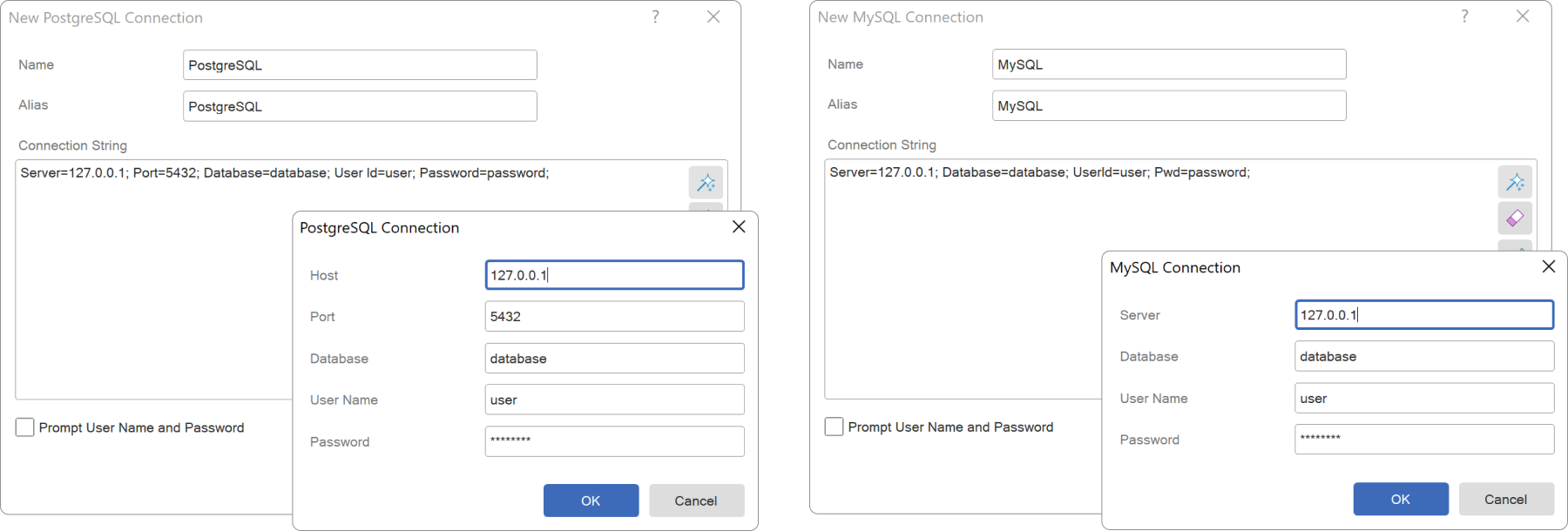
In this release, we have added a connection string editor for data sources like PostgreSQL, MySQL, and MariaDB, which enables you to easily define or modify their essential parameters. You can access the connection string editor by clicking on the Build control in the New Connection window.New features for the Gauge
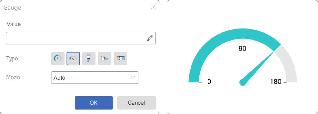
An update has been made to the Gauge component of the Half-Circular type, allowing the display of value labels within reports. This feature automatically calculates label values based on the range of values set in the component, making it easier to understand and interpret data presented in the report.Enhanced work with Conditions
We have significantly expanded the functionality when working with conditional formatting in reports. In this release, you can now easily copy and paste conditions for components from the clipboard. Simply use the hotkeys Ctrl+C and Ctrl+V or the Copy/Paste command in the Tools group of the component's context menu. Additionally, you can save the set conditions to a *.stc file and load them into other reports. The options to save and load conditions are located in the Conditions editor under the Actions menu.Copying Data Dictionary elements
Another new feature concerns copying data dictionary elements using the clipboard. Using the Copy/Paste commands from the context menu or the Ctrl+C/Ctrl+V hotkeys, you can copy each element of the dictionary individually, as well as their category. It is currently not possible to copy the entire data dictionary to the clipboard, but you can save it to a file and then open that file in a new report.The latest version is available for download here. Should you have any inquiries regarding the new features of our products, please do not hesitate to reach out to us. Our team is always ready and eager to assist you.